
Custom Bubble Color and Size:
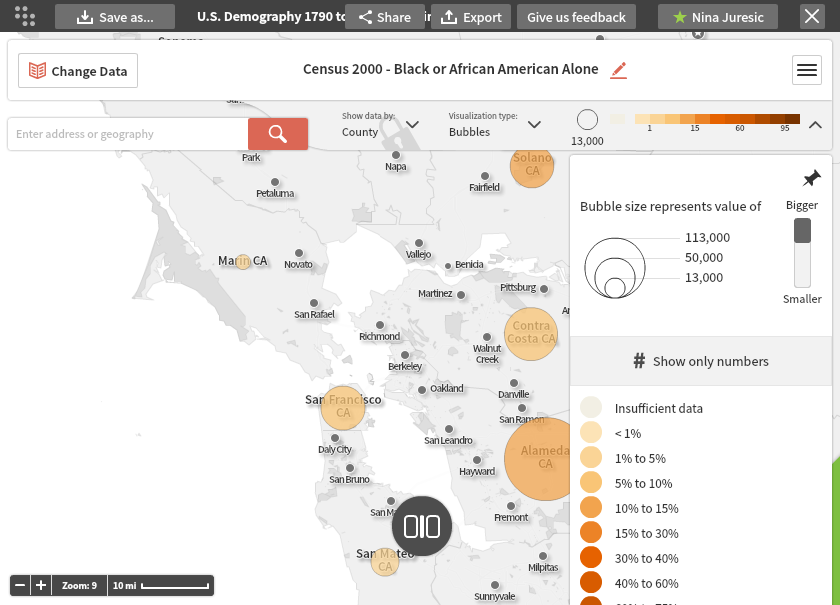
Bubble maps show data values by the location and size of the circles (bubbles). You can edit the color and size of the bubbles, as well as add a percentage display to this type of map.
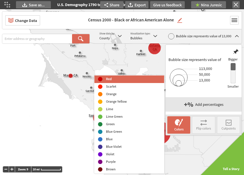
To change the color of the bubble, click on the legend and click on the "Colors" button. Here you may select a new color from the list.
In the legend you will also see a Bubble size definition. You can slide the bar up or down to adjust the ratio between the size of the bubble and the value it represents.
Adding Percentages:
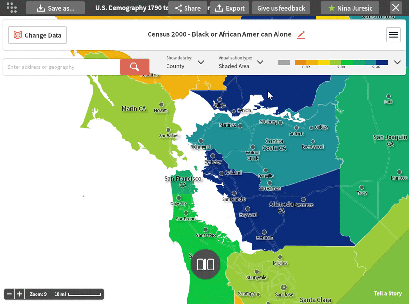
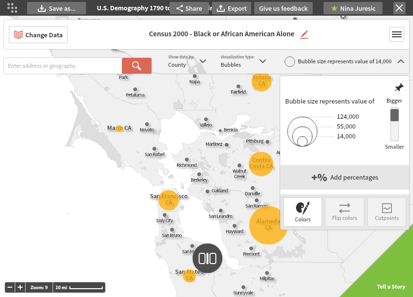
Bubble maps have the ability to display multiple pieces of information in a single visualization. The size of the bubble shows the value, and you can add a color gradient to show the related percent. Click on the "+% Add percentages" button to activate this option. For example, in the next map, the size of the bubble shows the number of African Americans in a county while the color of the bubble shows the percent of the county population that is African American.