
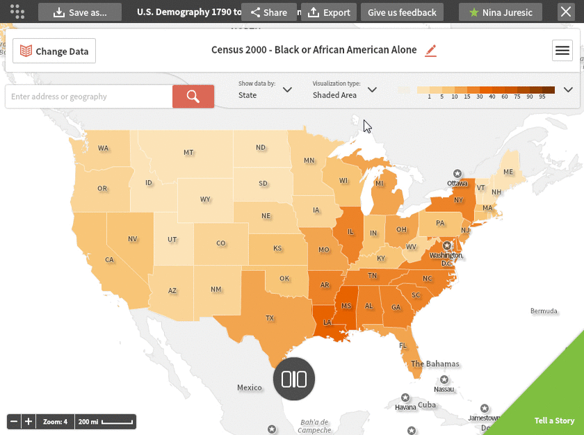

Data Display (shaded, dot density, and bubbles):
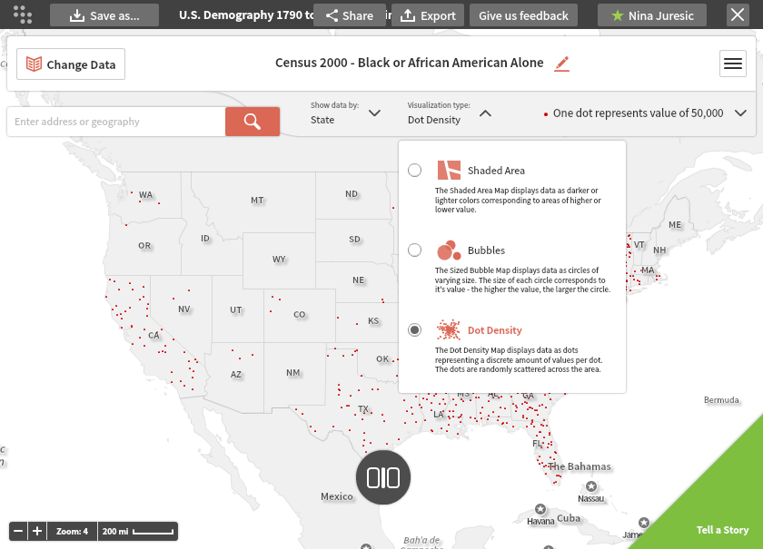
The data can be displayed as a shaded areas map (the default as shown), or, for many variables, as a dot density or bubble map. You can select which type of map you want from the Visualization type menu options.
Each type has an explanation and can be clicked from the list. In this example, the legend notes that one dot represents 50,000 African Americans.
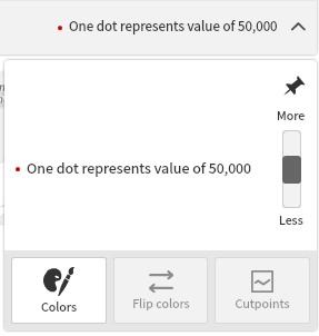
You can change the dot number and color using the menu on the right.
You can also select the bubbles option, which shows another way of visualizing the data.
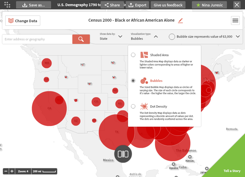
Here you can see that the sizes of the bubbles vary from county to county. The bubbles can represent the number of African Americans, or the percent of African Americans.
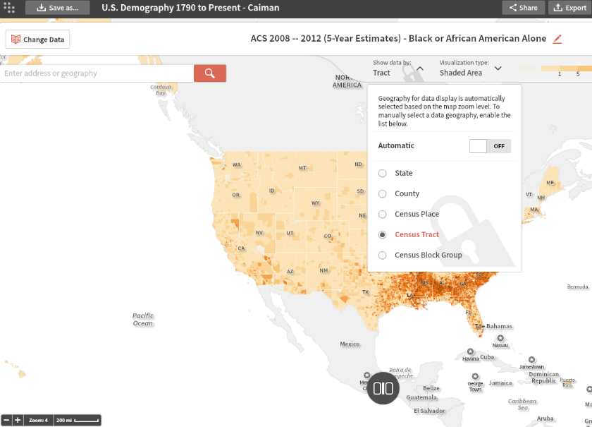
Geographic Selector:
You can control the geography detail display from the menu next to the zoom tool. It automatically adjusts depending on your zoom level, or you can change the level shown manually.
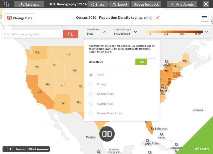
For example, you may want to see county-level data for a map of the entire United States to get a better sense of how the population is distributed. Social Explorer can even display data at the census tract level for a nationwide map. (If you override the automatic geography level, you will see a gray padlock appear.)
Now, users can explore data by ZCTA5 (zip codes), School Districts (UNSD, SCSD, ELSD), Metropolitan Statistical Areas (MSA), Public Use Microdata Areas (PUMA) and Congressional Districts.

