Opening the Maps:
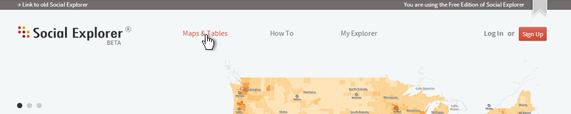
Starting from the main site, click on the Maps & Tables tab.
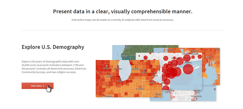
Then click on the Start Here button.
Map Navigation :
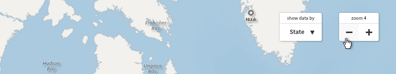
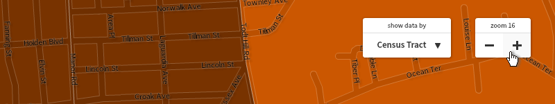
Over on the top right of the map dashboard, you will see the zoom control. Click on the plus or minus sign to zoom in or out of the map area. You can also use the scroll-wheel of your mouse, or double click to zoom.
As you zoom in, you will notice that the boundary lines are changing. You can see more detailed areas as we move in closer. And as you zoom in further, census tracts come into view, along with local place names, and even streets. (If you squint, you might be able to see your neighbor waving…)
Search:
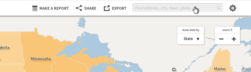
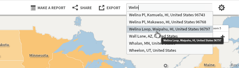
To research a specific place, you can lookup any location or address using the find tool. You can type in a city, county, street address, zipcode, etc.
Start typing, and select the address or location from the list of options. The map will then zoom directly to it.
Browsing Data:
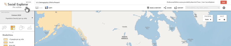
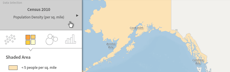
On the left, you are looking at the main map data selector. By default, the data selector says Census 2010/Population Density.
If you click on it, a menu will open with different year and category options.
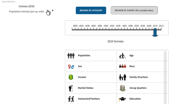
The slider bar lets you choose which year you want to examine. As you can see, census data spans over 220 years from 1790 to the present.
You will notice that not all categories are available for all decades, as some survey questions change from year to year and new ones are added or subtracted (such as slavery and unmarried partners).
Going back to your list of data options in a data category, you will see all variables from the 2010 Census and other surveys too. Next in the list we see the five-year, three-year, and one-year American Community Surveys variables.
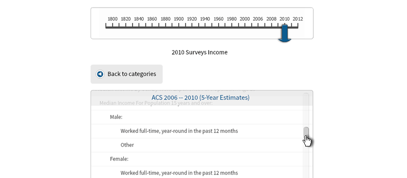
The American Community Survey (or ACS) is a very detailed annual survey, which replaced the Census “long form.” For more on the differences between the census and the ACS, please visit the FAQ.
You will see many variables to choose from for some categories, such as income, which has a number of options from income levels, to earnings by education, to public assistance income, and more.
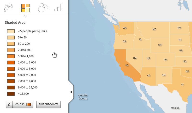
Legend:
Below the data selector is the legend. Social Explorer automatically colors this map according to population density. Each color from the map is paired with the percent or range of numbers it represents.
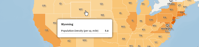
Mouseover:
Bring your cursor over to the map area. Mouseover different areas of the map to display the data. For example, if you mouseover Wyoming, you see that the state has a population density of 5.8 people per square mile. Meanwhile, in New Jersey, the population density is 1,195.5.
Returning Home:
If you want to return to the main website at any time, simply click on the Social Explorer logo in the top left corner (after saving any maps/projects).