Finding the right data is no small task, so we made sure all our data are carefully curated and organized by category and by year to ensure seamless usability.
Once in the map app, click Change Data in the upper left corner and select Browse by Category or Browse by Survey.
Browse by Category
In the Browse by Category tab, select the year you want to display the data for.
Click the category you’re interested in.
Select the variable you want to visualize.
Browse by Survey
In the Browse by Survey tab, select the survey and year in the Survey dropdown menu.
Select the dataset in the Dataset field.
Select the category in the Table field. (Note: You can also search all the tables by entering your search term at the top of the dropdown menu.)
Click the variable you want to display in the Variable field.
Customize The Look And Feel Of Your Map
Once you find the right data, take your map to the next level by tweaking the visual elements. You can choose the geography level you want to display the data for if you’re not happy with the level Social Explorer suggested and change the visualization type. Let’s break it down!
Note: Use the search bar on the top left to find a specific location. Enter any state, city, county, street address, zipcode, etc. and select from the results list.
Social Explorer allows you to further customize your map, whether you want to change the bubble size or use a different color scheme. Here’s how it’s done.
Select the visualization type that works best for the dataset displayed on the map, and it’s instantly applied on the map.
Note: Certain visualization types are disabled for certain variables. Bubbles and Dot Density are used for counts. Shading, on the other hand is used for percentages, medians, rates, averages or other area normalized measures like population density.
After you select the visualization type, click the Legend and select Colors to customize the look and feel of the visualization.
Choose one of the predefined color palettes or click Create a New Palette to create your own palette.
In the popup window, enter the palette title.
In the gradient slider, select colors for the starting and ending points.
Note: The default shaded area map displays cut points are determined by the data table behind it. Head over to Custom Cut Points to learn more about cut points.
Click Done.
Check out our resources to find out how to customize other vizualization types:
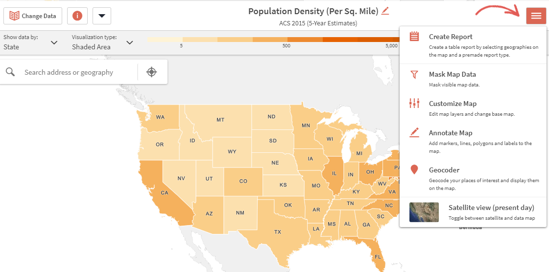
The map menu provides access to data reports, satellite view, map annotations, masking tool and the ability to turn map layers on and off. Read our step-by-step guides to learn about available menu options and their functionality:
The Masking tool lets you focus on a specific area of the map by removing data from all the surrounding areas. Data will be shown only inside the masked area, the rest will be grayed out.
Creating a mask
In the top right corner of the application, click the hamburger button, and select Mask Map Data.
In the Masking tool panel, select the data layer you wish to use to create your mask. You may also choose to include nested layers. These will show up as we zoom into the map. If none of the nested geographies are checked, you will only see the masked states.
There are three selection tools available in the masking tool. Individual geography selection allows you to select or deselect one geography at a time by clicking on it. Square and circle selection tools allow you to select multiple geographies within a specified distance from the center point of the selection tool.
Note: the masked area will not be a perfect square or a circle. Instead, all the geographies touched by the square or circle will be selected for masking in their entirety.
When finished, click Done.
To remove a mask, click the X symbol on the mask button in the upper left corner of the application.
Compare variables and notice trends
Social Explorer not only gives you access to extensive amounts of data, but it also allows you to compare different variables, notice trends, and reveal differences between time periods.
While in the map app, click the View icon and select one of the view modes. Each map in the side-by-side and swipe modes has its own interface, and to compare them, simply select the survey, category, and variable you want to display on each map. You can even customize visual elements of each map independently.
You can save your map and resume working on it at any time.
Click Save As in the upper left corner
Enter the name of your project and click Save.
Note: You can access all your saved maps by navigating to My Projects. After updating a previously saved map, click
Save to save the changes.
When you finish tweaking the map, you can click Share to email your map, embed it, share it on social media, or invite collaborators. If you want to export your map as an image, click Export.